Alphabet Pairing Logic Challenge
Reviews
This puzzle game stands out by combining basic letter recognition with genuine strategic depth. The obstacles are well-placed, forcing players to think ahead without making the experience tedious. The difficulty curve is smooth, and the clean visual design keeps the focus on the puzzles. It is an excellent choice for anyone looking for a calm yet mentally engaging activity that works for both children and adults.
Description
Core Letter Matching Mechanic
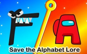
At its heart, this puzzle game asks players to pair each lowercase letter with its uppercase counterpart. The board presents a mix of letters scattered across the grid. By clicking and dragging, players draw a clear line between matching pairs. The challenge lies not in recognizing the letters themselves but in planning the most efficient route. Early levels feature straightforward pairings with no interference, allowing newcomers to grasp the basic flow. As players advance, the board becomes more crowded, requiring careful observation before making any connections.
Obstacles That Shape Strategy
What sets this game apart from simple matching exercises is the introduction of obstacles that block or disrupt paths. The letter F appears as a stationary barrier that cannot be crossed, forcing players to reroute around it. Detonation blasts can destroy any line that passes too close, adding a layer of risk to each move. Pools of lava occupy entire tiles and must be avoided entirely. These elements do not appear randomly; they are placed deliberately to create specific puzzles that require foresight and planning. Players learn to scan the entire board before drawing their first line.
Gradual Difficulty Curve
The game avoids overwhelming players by starting with simple, two-pair boards. Each new level introduces one additional obstacle or a more complex arrangement of letters. This steady increase in difficulty keeps the experience engaging without causing frustration. Players who enjoy a relaxed pace can take their time, while those seeking a quicker challenge can aim to complete levels with minimal moves. The design respects different play styles, making it suitable for both short breaks and longer sessions.
Visual Style and User Experience
The interface uses clean, colorful graphics that make letters easy to distinguish. Buttons and controls respond smoothly to clicks, and the drawing mechanic feels precise. There are no distracting animations or loud sounds, which helps maintain focus on the puzzle. The overall presentation is calm and inviting, reinforcing the game's family-friendly nature. Parents can feel confident letting children play, as the content contains no violence, adult themes, or in-app purchase pressure.
Educational Value for All Ages
While primarily a puzzle game, it naturally reinforces letter recognition for younger players. The need to identify both lowercase and uppercase versions of each letter helps build foundational literacy skills. Older players benefit from the strategic thinking required to navigate obstacles and plan efficient routes. The game does not lecture or quiz; it simply provides a context where letter knowledge becomes useful. This organic learning approach makes it a popular choice for parents seeking screen time that offers more than passive entertainment.




Comments
0 comments